Entertainment
Modern Star Trek’s So Ugly It Makes The Writing Look Good
By Chris Snellgrove
| Published

When longtime fans complain about NuTrek, they usually focus on the writing, which is understandable; after all, you can only hear so much vulgarity-induced Zoomer slang before you ask why characters hundreds of years in the future all sound like today’s edgy teens and not, you know, competent Starfleet officers. However, the biggest problem facing the franchise today has nothing to do with the writing or even acting.
The worst thing about modern Star Trek is that it has become relentlessly ugly. Despite spending over eight million dollars per episode, the uniforms, ships, and outer space visual effects are the worst in over 60 years of franchise history. If you doubt that, don’t worry: like a good Ferengi, I’ve got all the receipts!
Credit Where Credit Is Due

Let’s start with the uniforms, and in the spirit of fairness, let’s start with what has actually worked well. The uniforms in Strange New Worlds look great, though that was always a given; one of the goals of the show was always to update and modernize the aesthetic of Star Trek: The Original Series. That earlier show’s ‘60s uniforms are still absolutely iconic, and SNW simply updated their look, giving us something akin to the Kelvinverse: a slick redesign of the most timeless uniforms in the entire franchise.
This may be a hot take, but I actually really liked the uniforms in the first two seasons of Star Trek: Discovery. They felt like sleek, modern versions of the blue Away Team jackets worn by Captain Pike and Spock in the first Star Trek: The Original Series pilot episode.

Plus, they fit into existing lore better than most fans think: there have been weird uniform variations in this franchise from the beginning (like different insignias for different ships and variant uniforms for different specialties), and the Golden Age of Trek constantly featured characters using different styles of uniforms (like the mix of TNG and DS9 designs in Generations).
Throw in the fact that the Discovery was an experimental ship seemingly backed by Section 31, and these characters getting snazzy blue uniforms makes perfect sense. However, the crew ditched this killer look once they jumped to the 32nd century. Instead, they embraced brand new uniforms that just had one major problem: they were downright ugly, beginning a decline in Star Trek aesthetics that continues to this day.
It’s About To Get Ugly

In Season 3 of Star Trek: Discovery, our favorite characters get new uniforms that feel like a serious downgrade: those beautiful blue costumes get replaced with soulless gray uniforms whose dreariness is only broken up by a colorful division stripe. The characters looked blander than ever, and it didn’t help that this season’s storytelling was a serious downgrade from Season 2. Adding insult to injury, these drab uniforms looked way too much like what Kirk and crew wore in Star Trek: The Motion Picture, and that movie’s pastel pajamas are widely considered some of the worst uniform designs in the franchise.
Star Trek: Discovery Season 4 tried to correct this terrible design, replacing the blandness of the previous season with uniforms that were bold and colorful. That’s a good idea on paper, but in practice, the new uniform designs looked like what you’d get if you ordered Original Series costumes from Temu.

It’s hard to take any of these characters seriously when the open flap on the bottom of their tunics makes them look like a white-collar boss who felt wild enough to untuck his shirt and unbutton the bottom buttons to celebrate Casual Friday in style.
No, Captain, My Captain
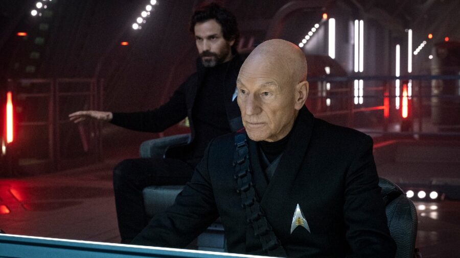
The next Star Trek fashion fail is partially the fault of arguably the most popular living Star Trek actor: Patrick Stewart. When Paramount lured him back for Picard, he was insistent that he didn’t want to wear a Starfleet uniform, which is why his character and his Season 1 crew run around in dark outfits that Stewart might as well have stolen from the set of David Lynch’s Dune. This is a big part of why the first and second seasons are so painful to watch: on top of writing so bad it makes Nemesis look like a masterpiece, the costume design for our series regulars is lazy and completely phoned-in.
The Starfleet uniforms were a bit better than Picard’s crew, but not by much: they alternated between looking like updated TNG Academy uniforms to uniforms that looked like plainer takes on the ones worn in Lower Decks. By Season 3, everyone was just wearing leather jackets with some light Star Trek theming on them.

This caused our returning TNG crew to look (embarrassingly enough) like bikers from an AARP-themed motorcycle club. It was like the producers were deathly afraid for this to look or feel like an actual Star Trek show, which is insane for a wildly expensive revival of the show that definitively brought the franchise back to life.
These Students Failed Fashion 101

The latest offender on the Star Trek fashion front is Starfleet Academy, a show that can’t decide exactly what it wants its protagonists to look like. Sometimes, instructors like Jet Reno wear uniforms that look like colorful hourglasses slapped haphazardly on a large expanse of black fabric.

The Doctor is wearing something akin to a monochrome version of his Voyager outfit, and Holly Hunter’s chancellor is wearing something like a monster maroon tunic without any of the flair. Over at the War College, Commander Nelrec is wearing something that looks like somebody tried to draw the Battlestar Galactica reboot duty blues from memory after being hit on the head.

Incredibly, the cadet uniforms are even more stylistically scattered: they mostly wander the campus in drab grey uniforms that look like an even worse version of what everyone wore in Star Trek: Discovery Season 3. Sometimes, though, they unzip that to wear just tight red shirts and black pants (which they adorn with futuristic tactical vests for rousing games of laser tag). Speaking of laser tag, after winning a single game against the War College, they wear letterman jackets, which leaves me wondering if anyone on the writing staff actually played sports in school.
None of these designs is great (minus the inexplicably comfy-looking Starfleet Academy hoodie), and several are downright ugly. That ugliness is made worse by the sheer visual chaos of characters that have more wardrobe changes per episode than most cosplayers do all year. This is symbolic of Starfleet Academy’s biggest problem as a show: it’s trying to be too many different things all at once, ultimately losing its own identity in a frantic rush to please fans of every era.
Clothing Maketh The Spaceman

Believe it or not, this barely scratches the surface of what makes NuTrek so ugly. I haven’t gotten around to forgettable ship designs (quick, draw the Starfleet Academy teaching ship from memory, I dare you!) and lazy outer space effects that make battles increasingly hard to follow. Those battles alternate between being visually boring (like the Battle of the Binary Stars in Discovery) to pathetically lazy (like Riker threatening the Romulans in Picard with an entire fleet of copy/paste ships). After spending more than $8 million per episode, NuTrek gives us space battles with less variety and excitement than Deep Space Nine did in the ‘90s.


The biggest issue is still the clothing, which has just gotten worse since Discovery first aired nearly a decade ago. Star Trek is a franchise with over half a century of cool clothing designs, and The Next Generation is proof that Paramount once knew how to update the designs that made The Original Series into a pop culture phenomenon. If the creators behind NuTrek are completely incapable of making these shows look decent, they will have nobody but themselves to blame when audiences stop watching altogether.
Entertainment
The Best Horror Series Ever Made Is Now Streaming For Free
By Chris Snellgrove
| Published

My absolute favorite kind of movie is the anthology. When you have a collection of short films all rolled into one, it provides the ultimate ROI for the audience. Don’t like one of the stories? You can just thug it out with the short runtime or skip ahead to the next tale. Either way is infinitely preferable to slogging through a two-hour film that started boring you to tears in the first scene. The anthology is much rarer in television, however, because networks and streamers have learned just how attached fans get to the same characters and stories, causing them to run these shows into the ground.
Heroes, Stranger Things, Star Trek: Discovery…what do all of these shows have in common? They were designed to be anthologies that would change things up each season, but their early success meant we were stuck with the same cast for years as the show got worse. Fortunately, true anthology lovers are just a click away from getting their fix. Right now, Tales From the Crypt is streaming for free on Tubi, just waiting to delight all you ghouls and boys. It’s not just the perfect anthology show; it is, in fact, the greatest horror series ever made!
Meet The Cryptkeeper
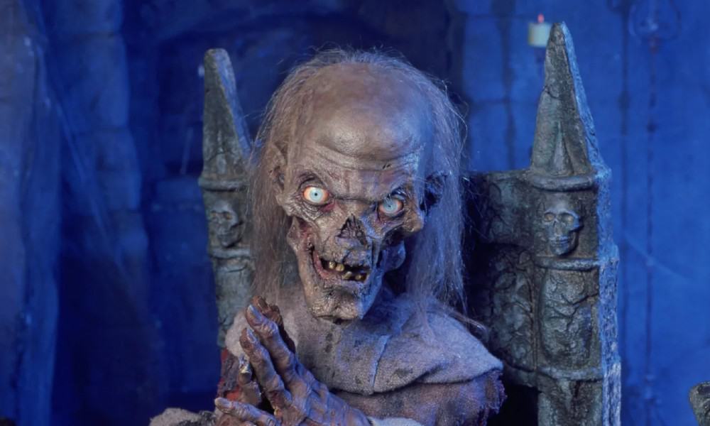
Tales From the Crypt fully embraces its anthology format, with every single episode focusing on different characters and different terrifying tales. What ties all of them together is our host, the Cryptkeeper. He’s a snarky, hilariously mean corpse of a character brought to life by a small army of puppeteers. The show originated on HBO, and its creators embraced the fact that it didn’t have to abide by any of the restrictive standards of network television. As such, episodes were filled to the brim with vulgar language, nudity, sex, and more buckets of blood than you can shake a bodybag at.
Younger horror fans should know that it’s almost impossible to overstate the popularity of Tales From the Crypt and its ghoulish host. Despite all the blood, breasts, and beasts, the show was wildly popular with kids, including my own underage self. Accordingly, it got two spinoffs aimed directly at children: Tales From the Cryptkeeper (a Saturday Morning children’s cartoon) and Secrets of the Cryptkeeper’s Haunted House (a weird gameshow). If that seems odd, this was during the same time that Kenner marketed toys based on Terminator 2 and Aliens directly to kids. What can I say? The ‘90s were weird, man!
Friends In Low Places

One compelling reason to check out Tales From the Crypt is that it had plenty of awesome guest stars, all of whom were happy to do an episode without being tied down to a long contract. Guests included Arnold Schwarzenegger, Brad Pitt, Michael J. Fox, Tom Hanks, and so many more. In most cases, these actors are performing against type, making what happens to them onscreen that much more shocking. Trust me: if you only know actors like Robert Picardo and Wil Wheaton from Star Trek, you’ll never look at them the same way after watching Tales From the Crypt.
For me, though, the single best thing about Tales From the Crypt is the show’s wicked sense of humor. With his relentless puns, wild expressions, and unhinged laughter, the Cryptkeeper sets the tone for a show that has black comedy running through its veins at all times. This adds serious entertainment value and also helps position the show as a light (but filling) bite for horror fans. Not in the mood for elevated horror and don’t have the time for a two-hour psychological thriller? You can always count on Tales From the Crypt to deliver a perfect slice of scary entertainment in under 30 minutes.

There’s not much more to say, especially without spoiling these awesome episodes. Ready to see if this early HBO success story lives up to the hype? Maybe you want to laugh and scream in equal measure, or just write down some weird new puns with which to torment your children? Whatever your reason, the best horror series ever made is just a click away. Tales From the Crypt is currently streaming for free on Tubi, which is arguably the best platform for any boils and ghouls who love a good scare!
TALES FROM THE CRYPT REVIEW SCORE
Entertainment
The Eufy E25 2-in-1 robot vacuum is $400 off at Amazon right now
SAVE 40%: As of July 20, you can get the Eufy E25 robot vacuum-mop combo for $599.99, down from $999.99, at Amazon. That’s a 40% discount or $400 in savings.

$599.99
at Amazon
$999.99
Save $400
As you’ve probably read by now, I have two beagles who love to destroy my floors (particularly right after I’ve cleaned the entire apartment). To keep my sanity intact, I own an arsenal of cleaning supplies, including the Dreame L60 Pro Ultra and the Aero Pro Steam (I call it my “Dreame Team“). But I also know that brand loyalty usually takes a backseat when a really good discount pops up. (Plus, it’s my job.)
Right now, you can get the Eufy E25 robot vacuum-mop combo for $599.99, down from $999.99, at Amazon. That’s a 40% discount or $400 in savings.
Mashable Trend Report
It features 20,000 Pa of suction, empties its own dustbin, and even washes its own mop roller. It also comes equipped with AI obstacle avoidance to dodge everyday clutter (like rogue dog toys), and an extending arm to scrub right up against your baseboards. But, according to some Amazon reviewers, there are a few minor drawbacks, including a louder-than-usual drying cycle and finicky rollers.
Even so, picking a good spot for the base or doing occasional maintenance is a small price to pay to never have to mop your own floors again.
Entertainment
The moments that defined the 2026 World Cup
Every four years, the World Cup reminds us why we fall in love with sports in the first place.
The 2026 tournament was one of firsts. For the first time, three countries — Canada, Mexico, and the United States — shared hosting duties. For the first time, the field expanded from 32 to 48 teams, giving more nations a chance to compete on the sport’s biggest stage and more federations the opportunity to showcase their depth.
That expansion brought historic debuts for Cape Verde, Jordan, Curaçao, and Uzbekistan. Their first appearances delivered some of the tournament’s most unforgettable moments.
It also felt like a farewell tour. Cristiano Ronaldo. Lionel Messi. Luka Modrić. Neymar. Son Heung-min. Guillermo Ochoa. A generation that shaped the sport for two decades took one last bow on the biggest stage, with several likely making their final World Cup appearances.
Taken together, those storylines made this World Cup feel bigger than any single match. Over the course of several weeks, the tournament gave us unforgettable goals, shocking upsets, viral celebrations, heartbreaking exits, and moments that transcended soccer altogether. Here are the moments that defined the 2026 World Cup.
Vozinha and the Blue Sharks
The best feel-good story of the World Cup has to be Cape Verde’s historic run and their goalkeeper, Vozinha (née Josimar José Évora Dias). The 40-year-old keeper and Cape Verde stalwart rocketed to international fame after a heroic performance against eventual champions Spain, keeping a clean sheet against the European giants to earn the 500,000-strong nation its first-ever points in a World Cup.
This Tweet is currently unavailable. It might be loading or has been removed.
Vozinha, who was on the verge of retirement from club football, blew up on social media, amassing 29 million Instagram followers to become one of the most-followed soccer players on the platform.
The magic kept coming for the Blue Sharks. A 2-2 draw with Uruguay and a scoreless draw against Saudi Arabia secured a second-place finish in their group behind Spain, and a spot in the knockouts. There, the smallest nation ever to reach a World Cup knockout round took defending champs Argentina to the brink, including a spectacular extra-time equalizer from Sidney Lopes Cabral. It wasn’t enough — an own goal in the 111th minute gave Argentina the lead, and the win.
This Tweet is currently unavailable. It might be loading or has been removed.
Even in defeat, Cape Verde and Vozinha became the darlings of the 2026 World Cup, earning a hero’s welcome when they returned home to Praia, the nation’s capital.
America’s World Cup ends in disappointment and controversy
The U.S.’s lowest moment in the tournament came wrapped in controversy. Folarin Balogun was sent off in the round of 32 against Bosnia-Herzegovina for a tackle that injured Tarik Muharemovic — a red card overturned on review, then reinstated by VAR, that should have kept him out of the quarterfinal against Belgium.
Instead, on the eve of that match, news broke that President Trump had personally called FIFA president Gianni Infantino about the suspension, and FIFA’s disciplinary committee — invoking the same conveniently vague rule it used to keep Cristiano Ronaldo eligible for his final World Cup — cleared Balogun to play.
FIFA denied any connection to the call, but the optics were brutal regardless: the first in-tournament suspension reversal FIFA had made since 1962. Balogun’s actual impact on the game was negligible — one good chance in the 82nd minute that Thibaut Courtois saved — and the U.S. lost 4-1, undone far more by sloppy defending than by anything happening off the pitch. But the timing made it impossible to separate the two.
This Tweet is currently unavailable. It might be loading or has been removed.
This Tweet is currently unavailable. It might be loading or has been removed.
This Tweet is currently unavailable. It might be loading or has been removed.
A team that had looked loose and confident through the group stage and into the knockout rounds showed up tight and rattled.
Insane Third Place game ends Golden Boot race
The World Cup is known for its magnificent scorers: Pelé, Maradona, Klose. It’s rare to see one player absolutely rake in the goals in a single tournament, but 2026 delivered a real fight for the crown. Heading into the final weekend, Messi and Mbappé sat tied atop the table at eight goals each, having both already passed Miroslav Klose on the World Cup’s all-time scoring list along the way. Behind them, England’s Jude Bellingham and Harry Kane lingered at six apiece, two goals back but not out of it.
Then the third-place game happened, and it blew the race open. England beat France 6-4 in a match that had no business being that entertaining for a game “nobody wanted to play.”
Mashable Trend Report
This Tweet is currently unavailable. It might be loading or has been removed.
This Tweet is currently unavailable. It might be loading or has been removed.
Instead, it turned into an old-fashioned track meet. Mbappé found the net twice to push his tally to 10, breaking the tie with Messi outright and matching the mark he set back in 2022. Bellingham, meanwhile, kept crashing the box the way he had all tournament and picked up his seventh, cutting the gap to Mbappé to three with only the final left. With that crazy game over, and Spain’s 1-0 win over Argentina, Mbappé ended the tournament as the Golden Boot winner.
The last time this fixture featured multiple Golden Boot winners padding their totals was in 1990, and even that wasn’t a shootout like this one. Between Mbappé and Messi, both represent the first 8+ goal scorers since Gerd Müller scored 10 back in 1970.
We truly are blessed.
International fans experience American baseball
One of the best things about the World Cup is when international fans and players come to town and immerse themselves in local culture. The best subplot from this year’s World Cup was undoubtedly taking place at the ballpark.
With days off between fixtures, traveling World Cup fans started showing up in force at MLB games, and stadiums across the country turned into unlikely satellite fan zones. It kicked off on June 14 at Fenway, when Scottish fans fresh off a win over Haiti marched from downtown Boston straight into a Red Sox game — timed, by pure coincidence, with the ballpark’s own Scottish Heritage Night.
Two days later, the Tartan Army (the nickname for the Scottish supporters) packed part of the upper deck at Yankee Stadium, and by June 22, roughly 8,000 of them turned up in Miami for a Marlins-Rangers game, making up nearly half the announced crowd.
Norway’s supporters did their own version of the takeover at Citi Field on June 24, filling the outfield seats in Viking helmets and getting the stadium’s mascots to join their signature rowing celebration. Even England manager Thomas Tuchel, a generally terse-looking man, threw out a ceremonial first pitch at Kauffman Stadium during the team’s stay in Kansas City. He could definitely strike out Timothée Chalamet in three pitches.
This Tweet is currently unavailable. It might be loading or has been removed.
U.S. visa entry nightmare
For all the goodwill the tournament generated, the road to it exposed something uglier. In the run-up to the World Cup, visa denials and delays became a recurring headache for teams, and in some cases, outright barred people from the competition entirely.
Swiss forward Breel Embolo was blocked from boarding a flight to his own team’s training camp over a year-old conviction that had already been settled back home. South Africa’s delegation nearly missed its trip to Mexico when more than 20 players and staff got stuck waiting on visas, and Iran’s team ended up sleeping in Mexico every night of the tournament after U.S. officials barred its players and staff from overnight stays, with more than a dozen federation staffers, including the federation’s own president, never cleared to travel at all.
None of this happened by accident. It was the Trump administration’s own immigration architecture doing exactly what it was built to do, and the tournament exposed it long before the opening whistle.
The policy wasn’t limited to a handful of unlucky cases: 39 countries entered the tournament under some form of U.S. travel restriction, and for 19 of them the State Department had stopped issuing visas altogether, a list that happened to include four World Cup nations (Iran, Haiti, Côte d’Ivoire, and Senegal).
Somali referee Omar Artan, freshly named his continent’s top official and set to become the first Somali to work a World Cup match, was detained for eleven hours at Miami International Airport and sent back to Istanbul over alleged “associations with suspected members of terror organizations” that CBP officials declined to specify.
To be fair, Canada has also been just as strict, with Ghanaian fans getting an 11 percent approval rate for visas to the country. Most notably, Ghanaian player Thomas Partey had his visa and subsequent appeal denied and missed Ghana’s World Cup opener due to ongoing criminal proceedings in the UK. Partey, however, was allowed to play in the team’s other group-stage matches in the US.
Through all of this, FIFA, the one body with standing to push back, chose instead to call it a host country’s prerogative.
The world falls in love with Erling Haaland
The most terrifying striker in the world seems to be a completely normal guy. It’s something only Erling Haaland seems to be able to do, with the ruthlessly efficient Norwegian striker netting himself into the Golden Boot conversation alongside Messi and Mbappé.
Off the field, though, the man nicknamed “The Terminator” is a glorified Snapchat shitposter.
This Tweet is currently unavailable. It might be loading or has been removed.
This Tweet is currently unavailable. It might be loading or has been removed.
On his personal Snapchat, you can find selfies with Shrek, face filters, and a bit where he wanders around Manhattan in a cap pretending nobody recognizes him. Despite being two years younger than fellow Gen Z superstar Mbappé, the Manchester City striker doesn’t seem to carry the same weight of expectations as his world soccer compatriots. This man is doing photoshoots with cowboy hats and wearing shirts that say “y’all can kiss my Dallas.”
It’s probably why the world can’t get enough of him.
Estadio Azteca
The Estadio Azteca, the home of Mexican soccer, delivered one of the most breathtaking scenes in this World Cup.
This Tweet is currently unavailable. It might be loading or has been removed.
The stadium is a historic site not just in Mexico but also in World Cup history. It also made for some great memes. Mexico hosted the World Cup for the third time and, for the first time ever, won all three group-stage games. The vibes coming off El Tri and its fans were at an all-time high — probably the only thing higher than the altitude at Estadio Azteca, which became a running joke all tournament long.
This Tweet is currently unavailable. It might be loading or has been removed.
This Tweet is currently unavailable. It might be loading or has been removed.
This Tweet is currently unavailable. It might be loading or has been removed.